Branding, illustration,
and design.


Noted
branding / creative direction
We worked with hospitality specialists PG & Co to brand a new portfolio of hotels. Rather than homogenized, predictable properties, the Noted features stays with stories — hotels as unique as the travelers that seek them out.
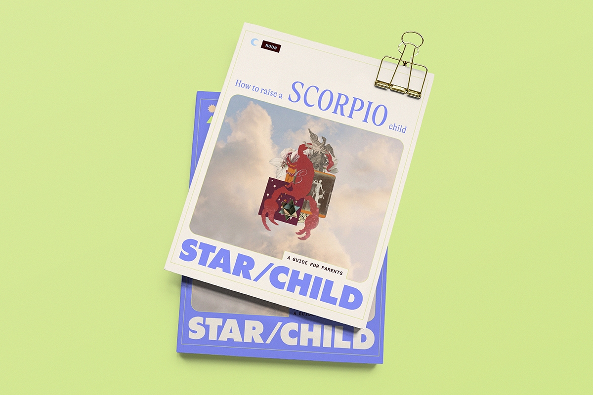
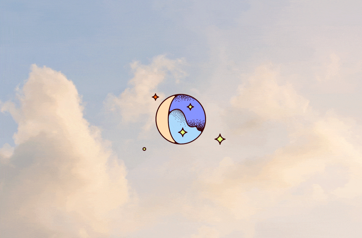
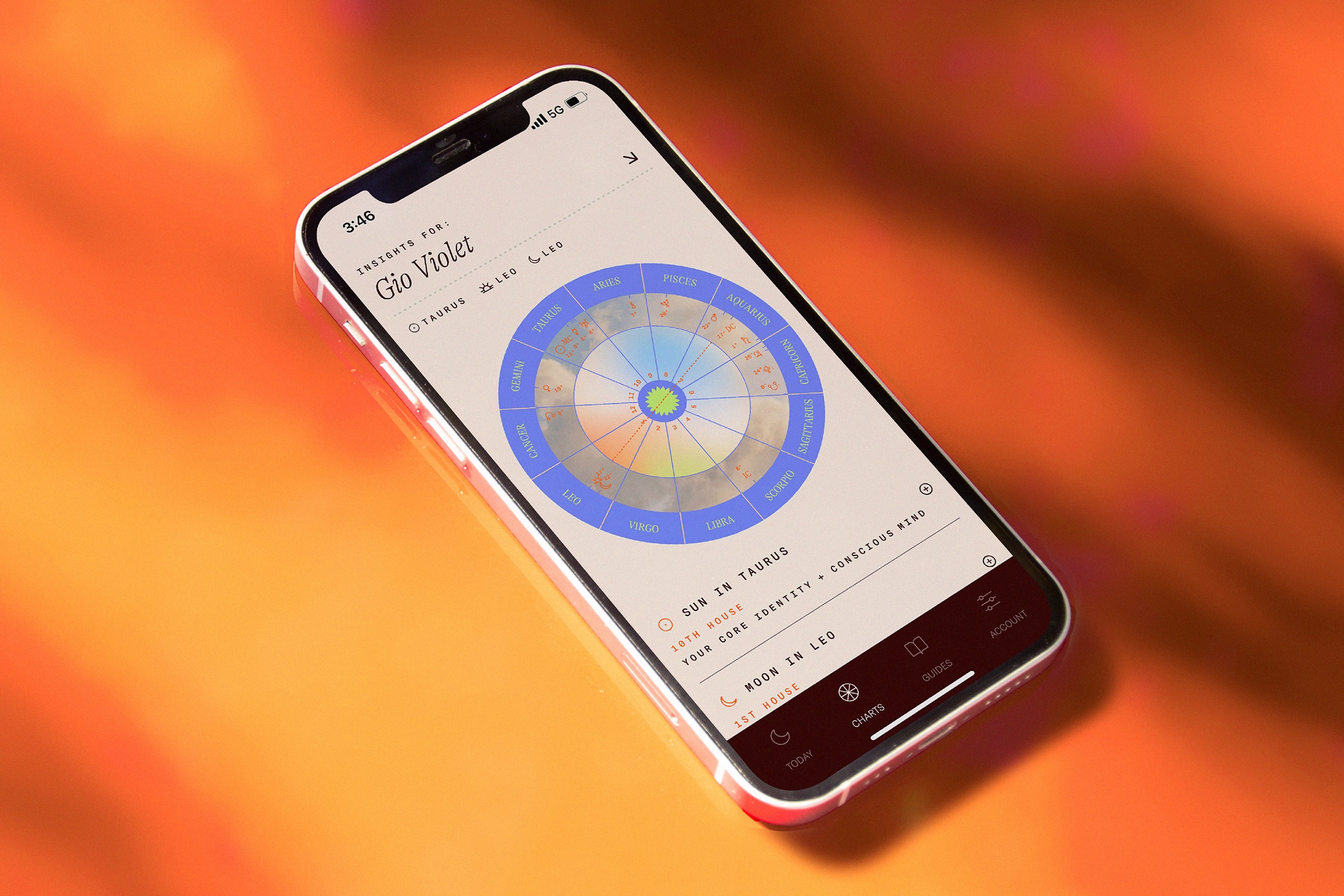
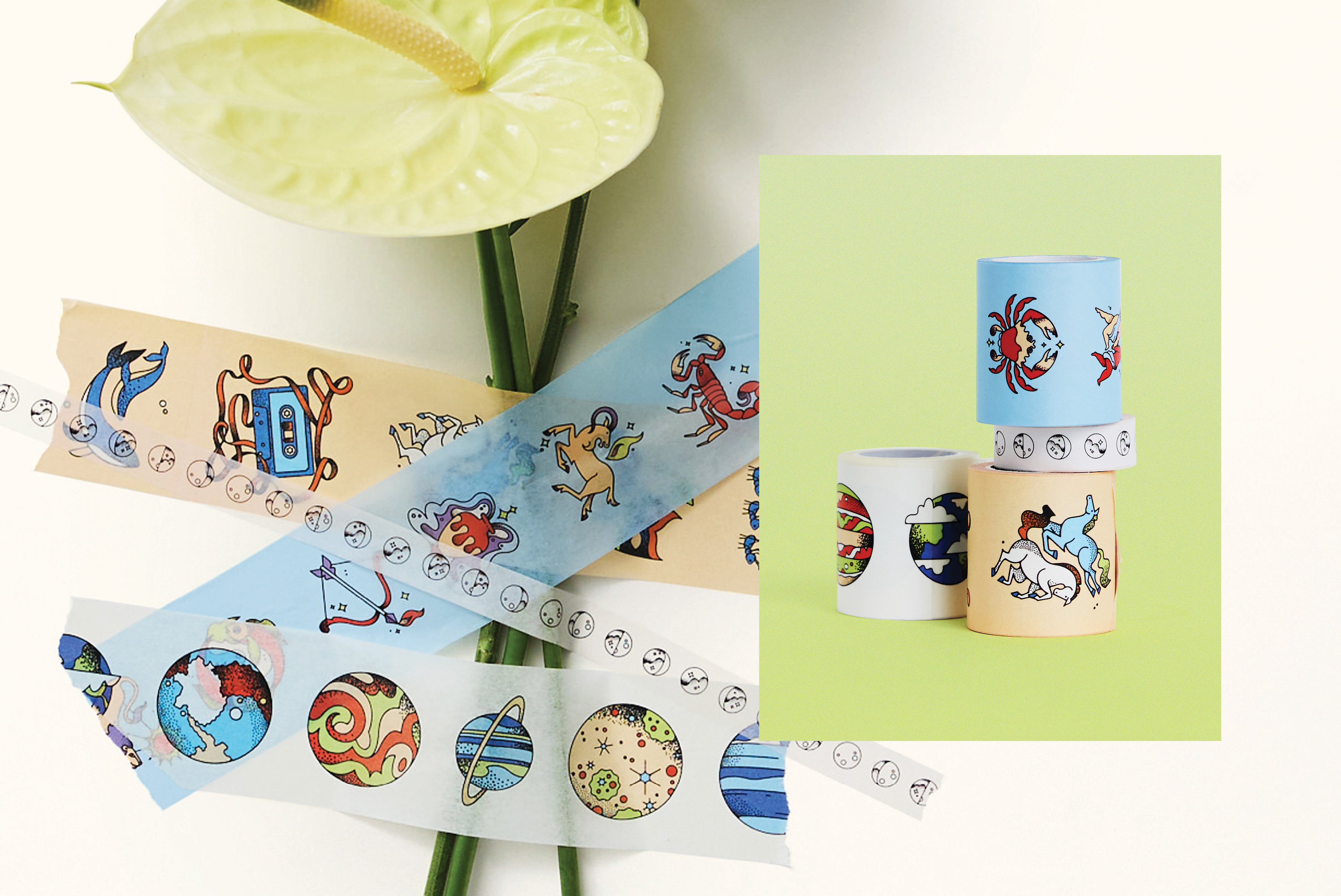
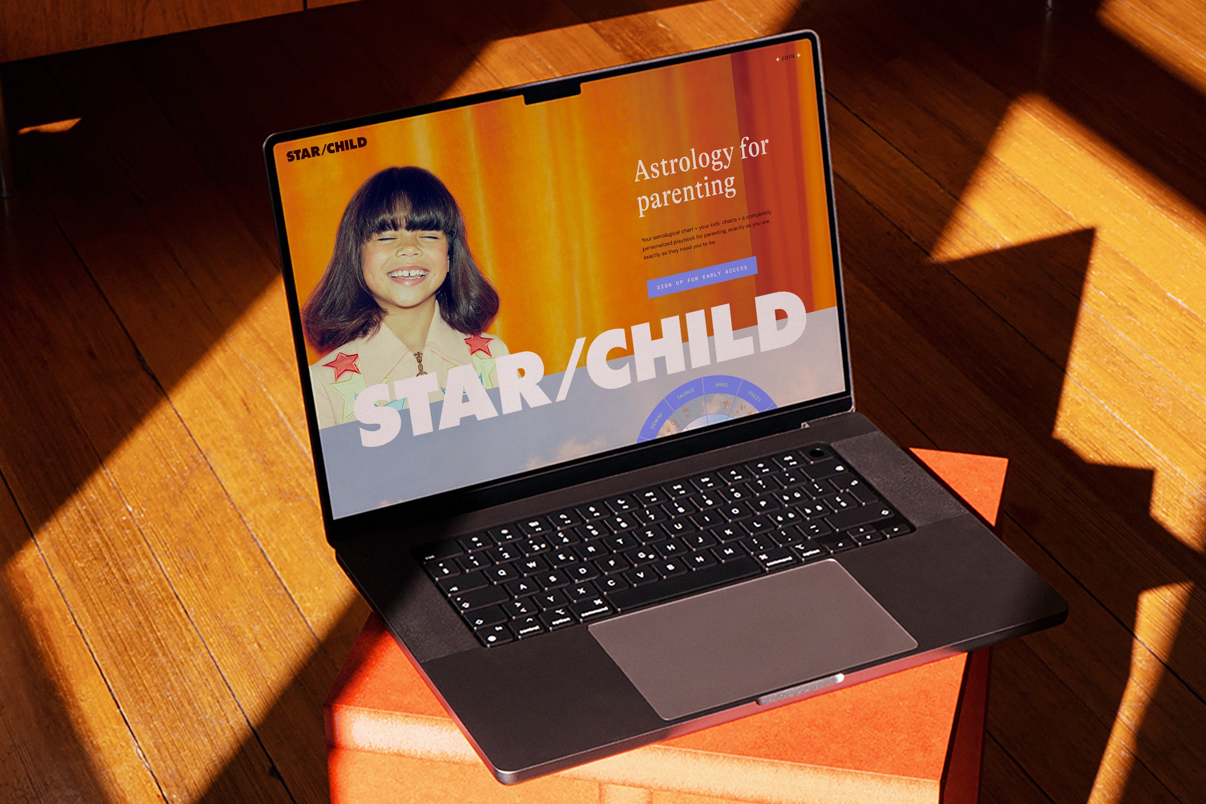
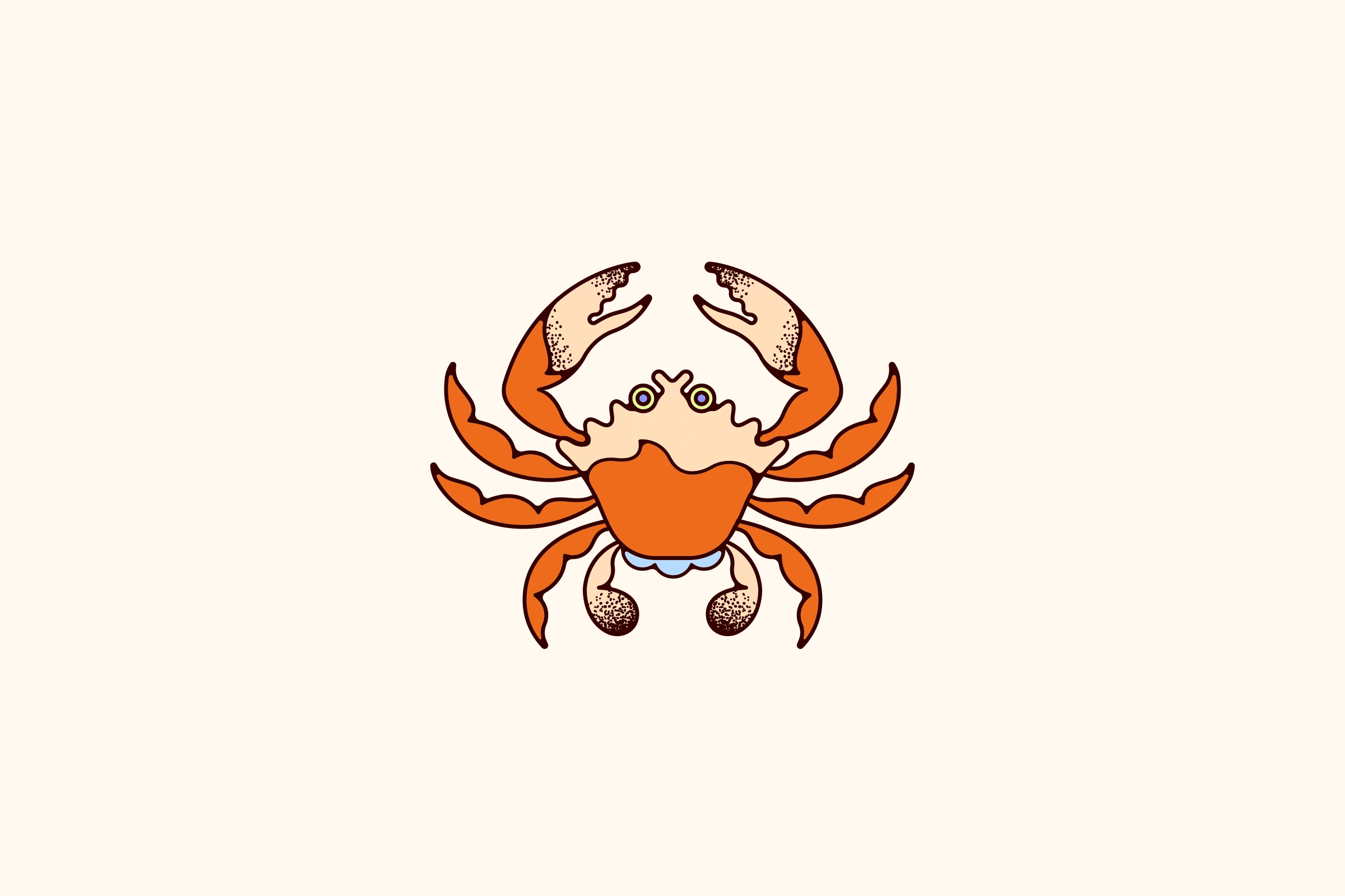
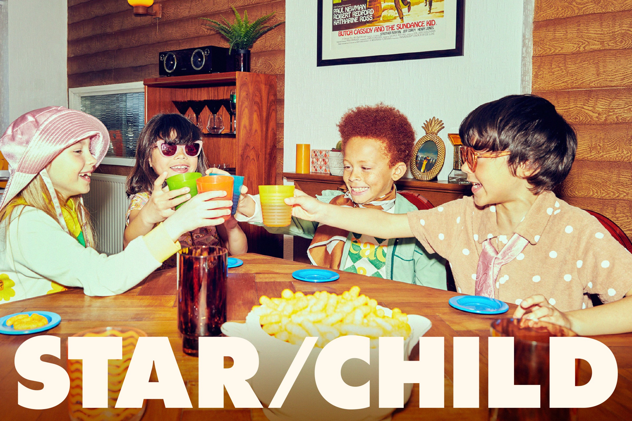
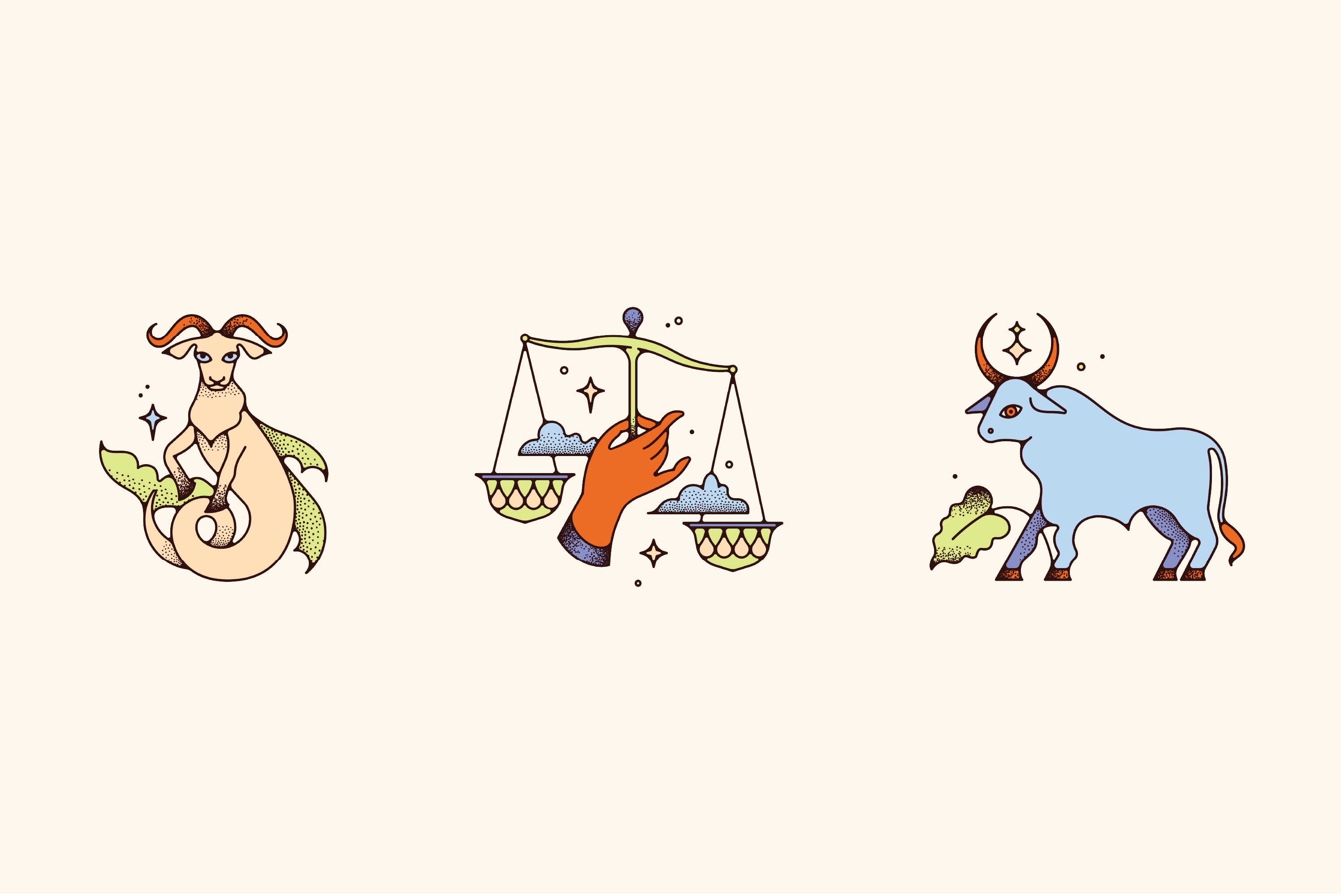
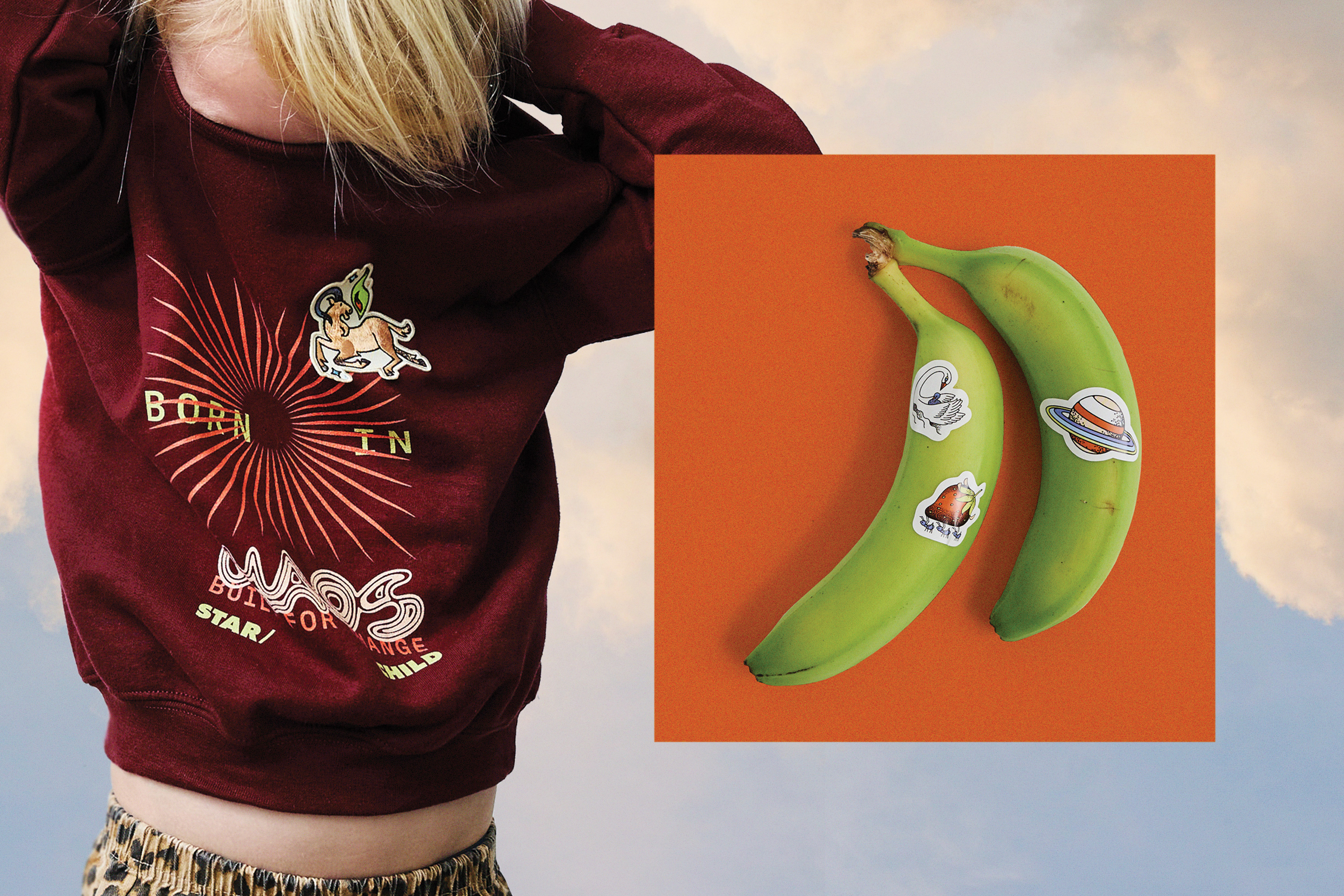
Star/Child
branding / illustration / Collateral
Star/Child is an astrology app for parents and children, offering daily insights, personalized guidance, and customized strategies for forging deeper connections between caregiver and kid. Second Marriage was brought on in the earliest stage of the project to create a brand style that’s trustworthy, aspirational, and – maybe most importantly – fun. With the help of digital designer Isla Murray, photographer Emma Tunbridge, and collage artist Mike Germon, we built out a brand that feels solid but playful, and subtly incorporates the mystical edge of astrology without losing credibility.
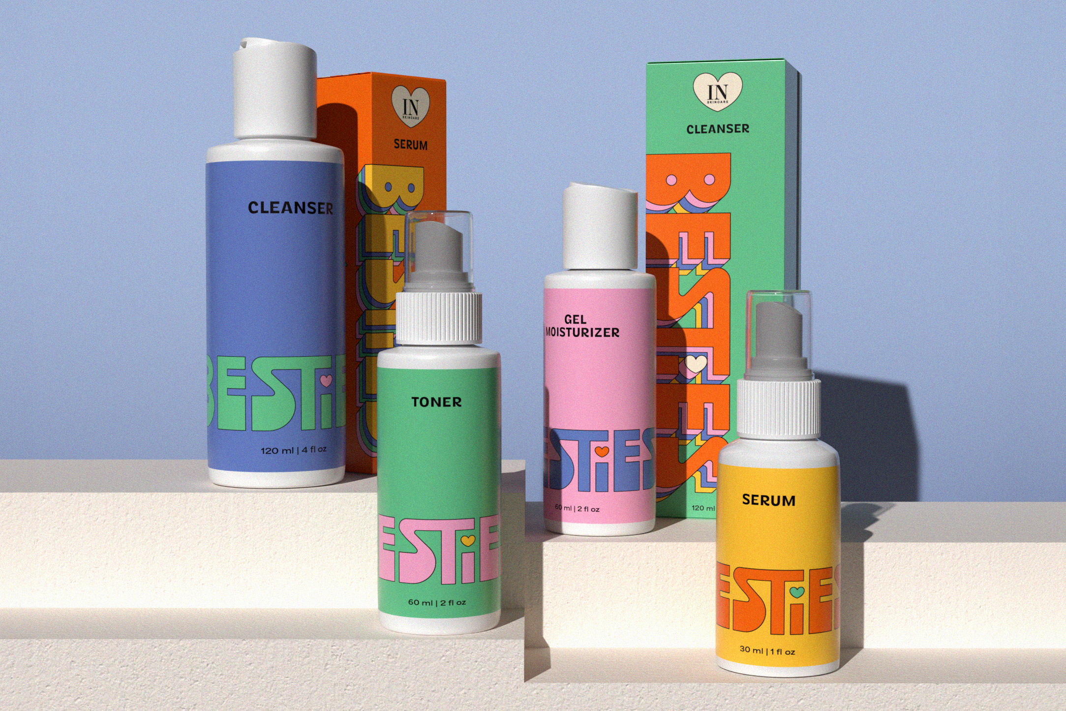
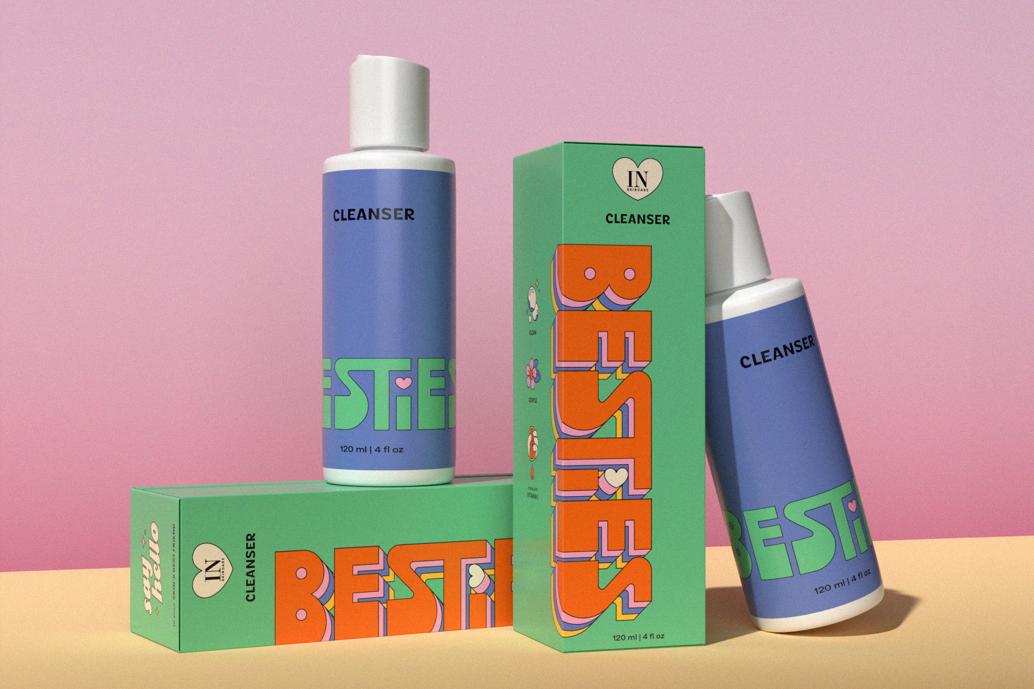
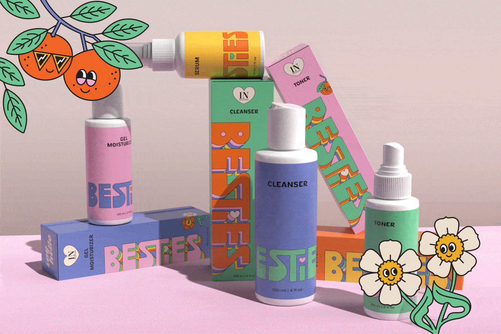
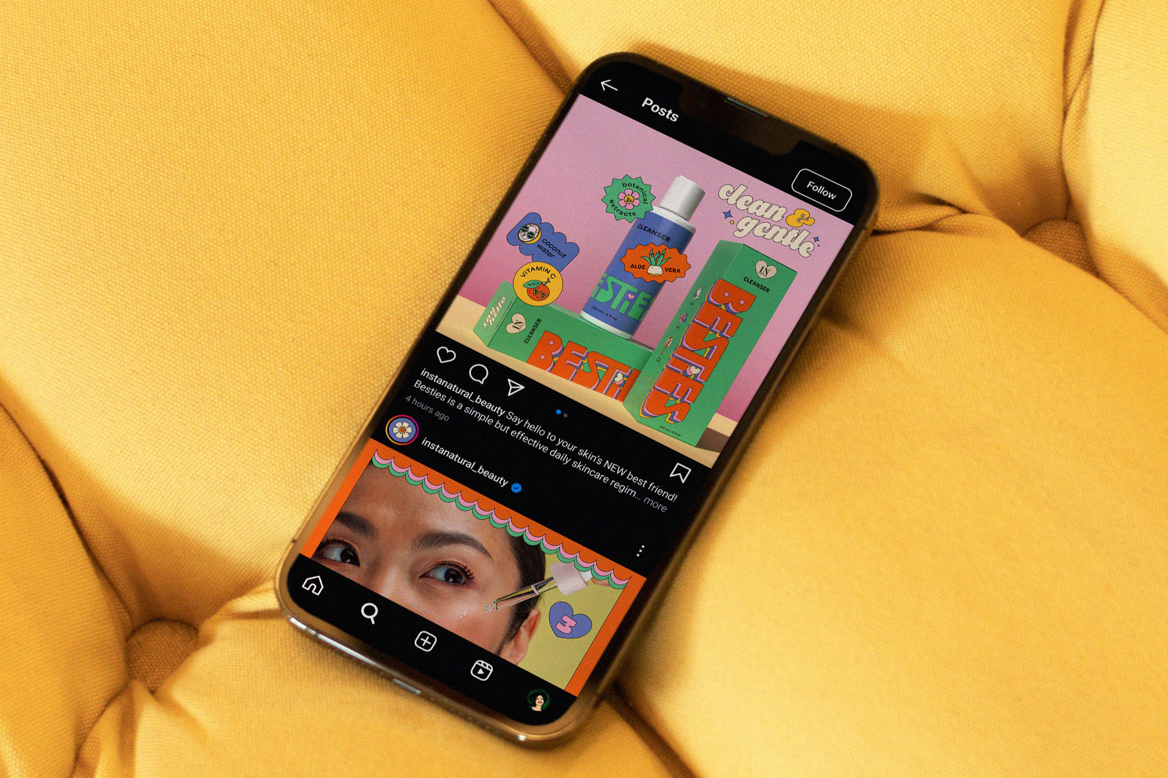
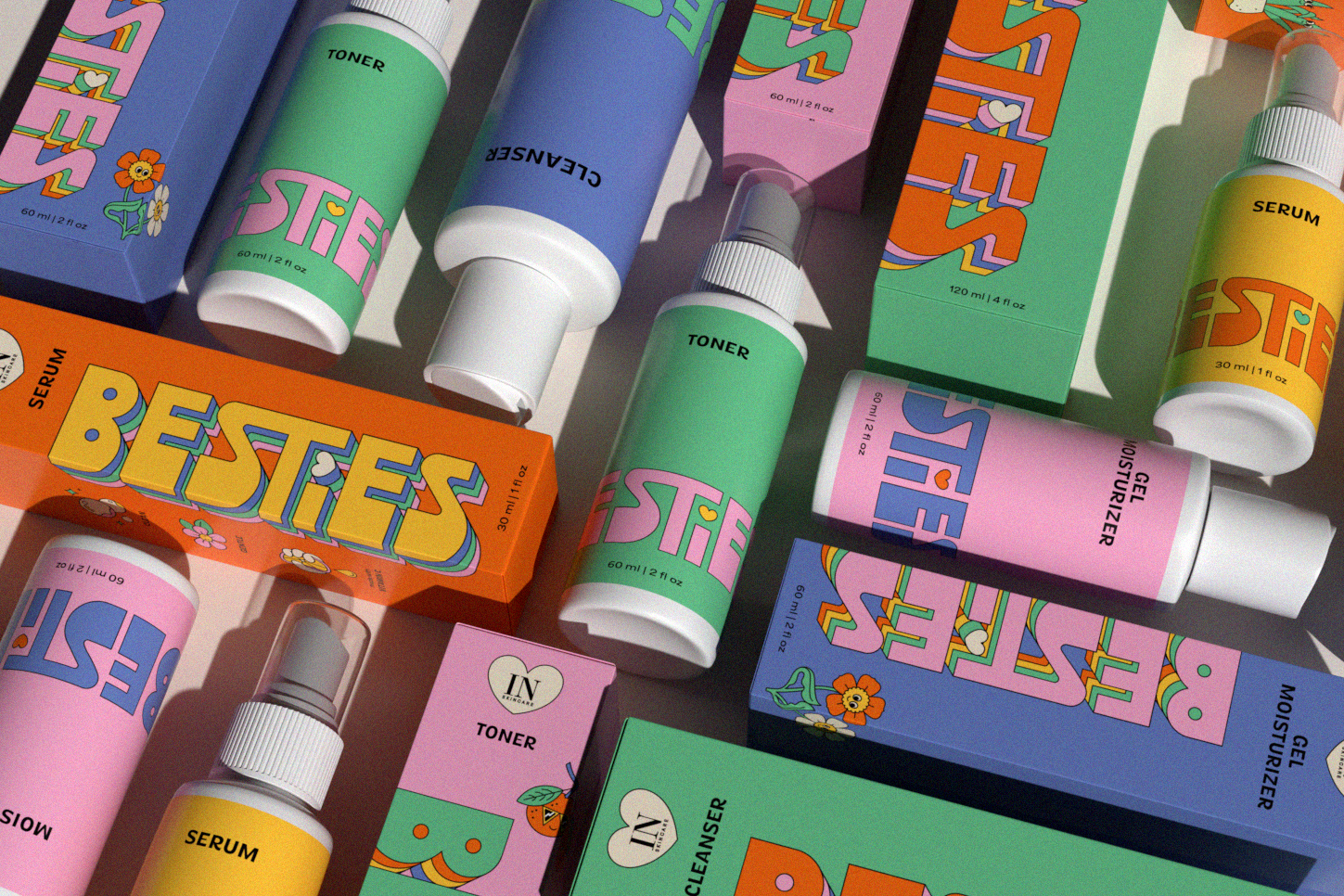
Besties
BRANDING / PACKAGING / ILLUSTRATION
Besties is a brand crafted for teenagers taking their first steps into skincare. Bursting with playful energy, Besties' goal is to make skincare accessible and fun. Second Marriage designed the logo, brand identity, and packaging, complete with lively illustrated characters. The result? A skincare experience that’s delightful, engaging, and perfectly tailored for its young, fun-loving audience.
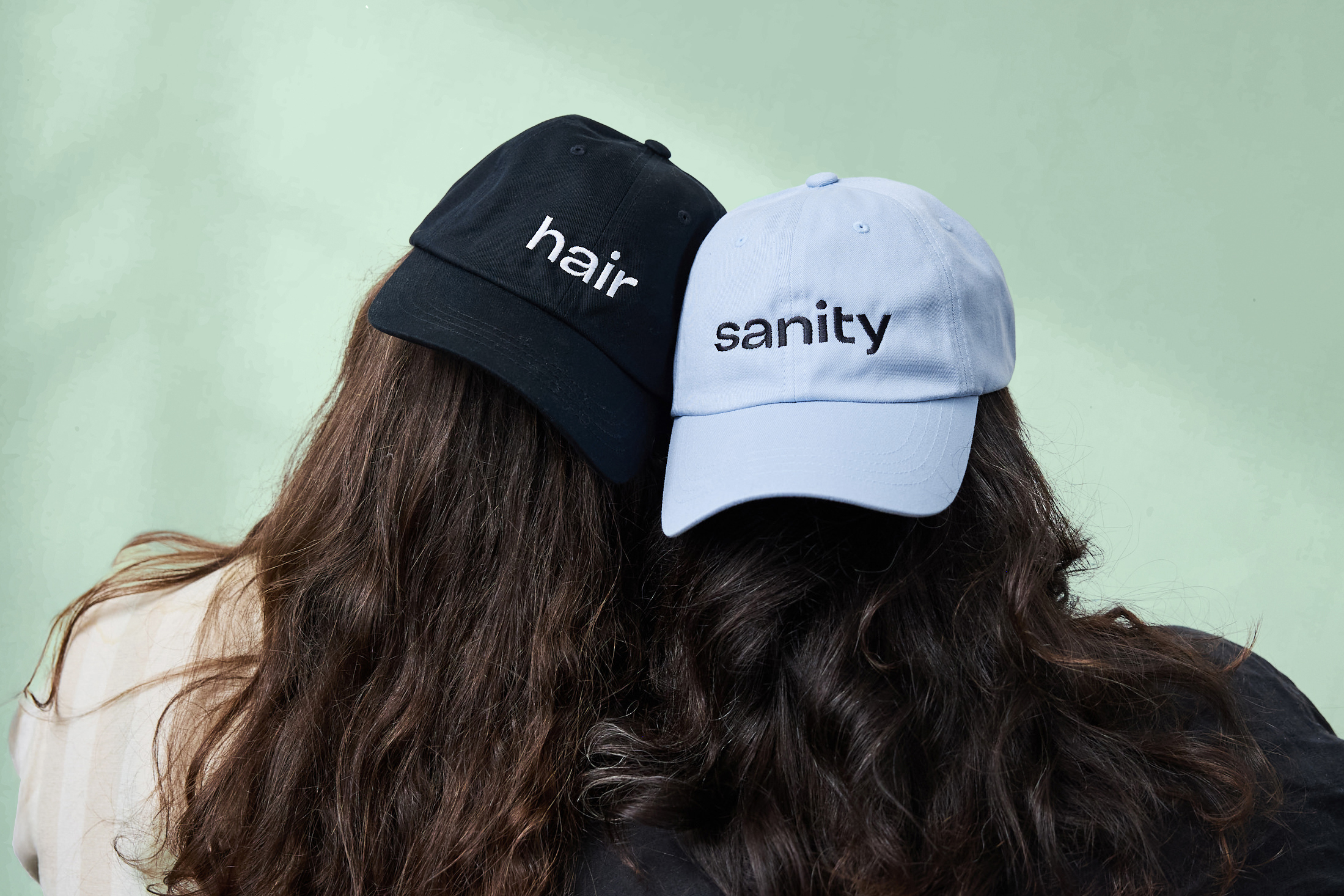
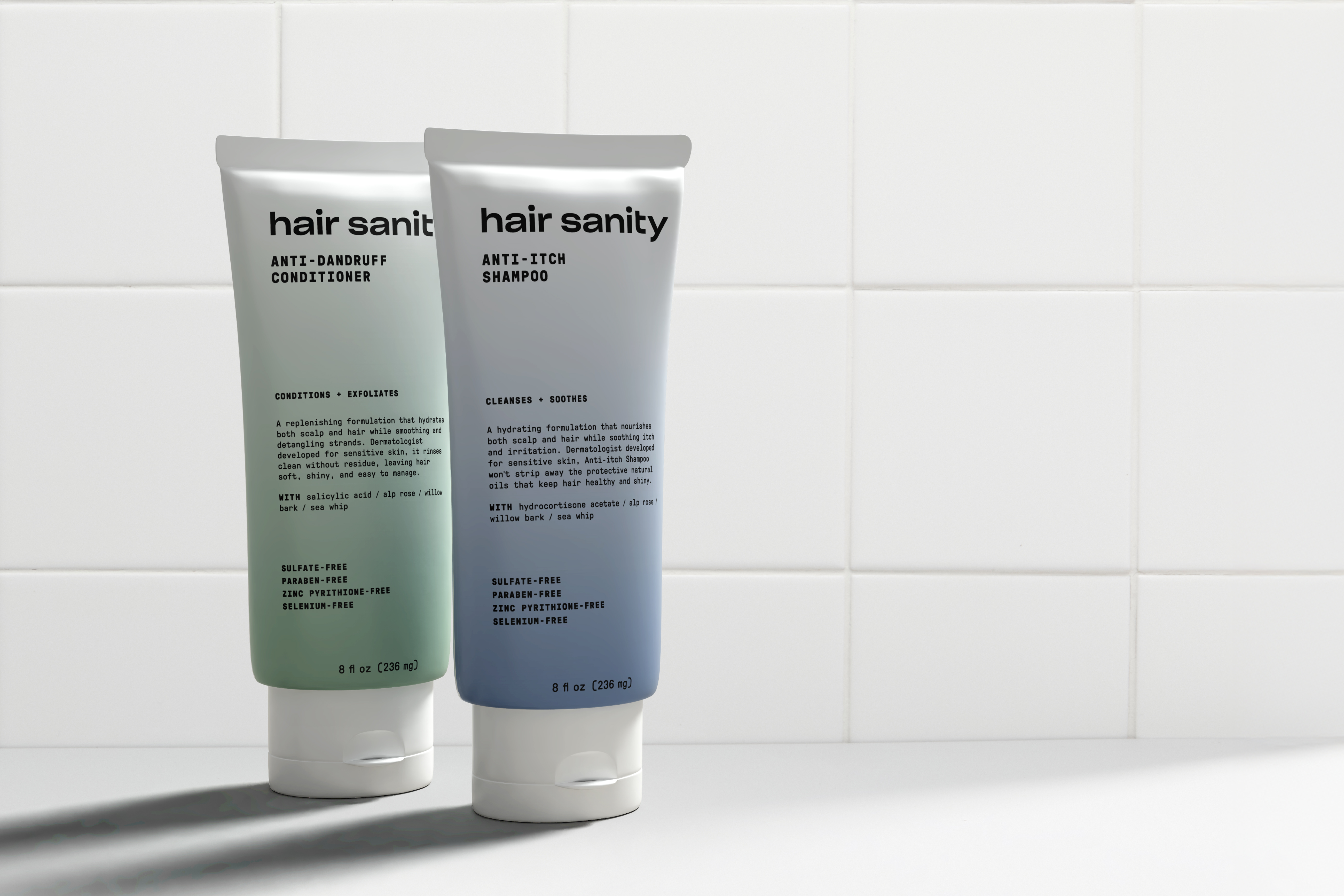
Hair Sanity
branding / packaginG
Hair Sanity is a dermatologist-founded brand that transforms scalp care into self-care. Rooted in science and guided by empathy, it offers innovative solutions that soothe, nourish, and restore, making scalp health both effective and indulgent.
We set out to create a brand identity that reflects this duality, combining clinical credibility with a sense of care. Our work included a custom wordmark, packaging, iconography, brand language, positioning, strategy, and art direction, all designed to express Hair Sanity’s vision with clarity and warmth.
We set out to create a brand identity that reflects this duality, combining clinical credibility with a sense of care. Our work included a custom wordmark, packaging, iconography, brand language, positioning, strategy, and art direction, all designed to express Hair Sanity’s vision with clarity and warmth.